Brand Identity / Brand Strategy / Design System
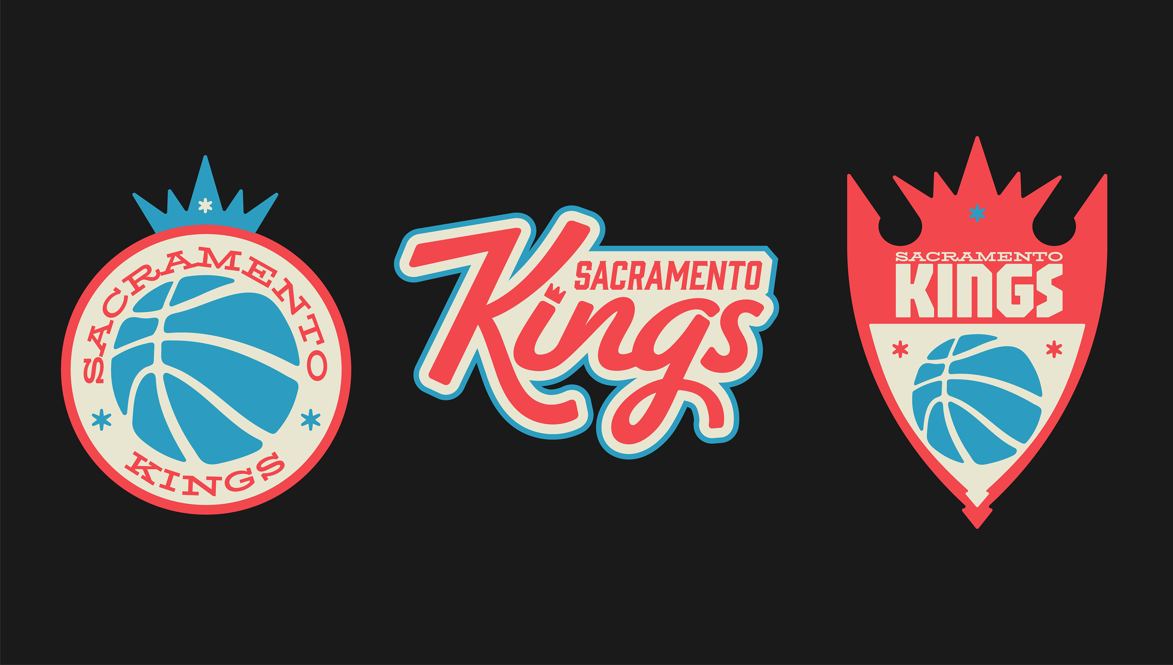
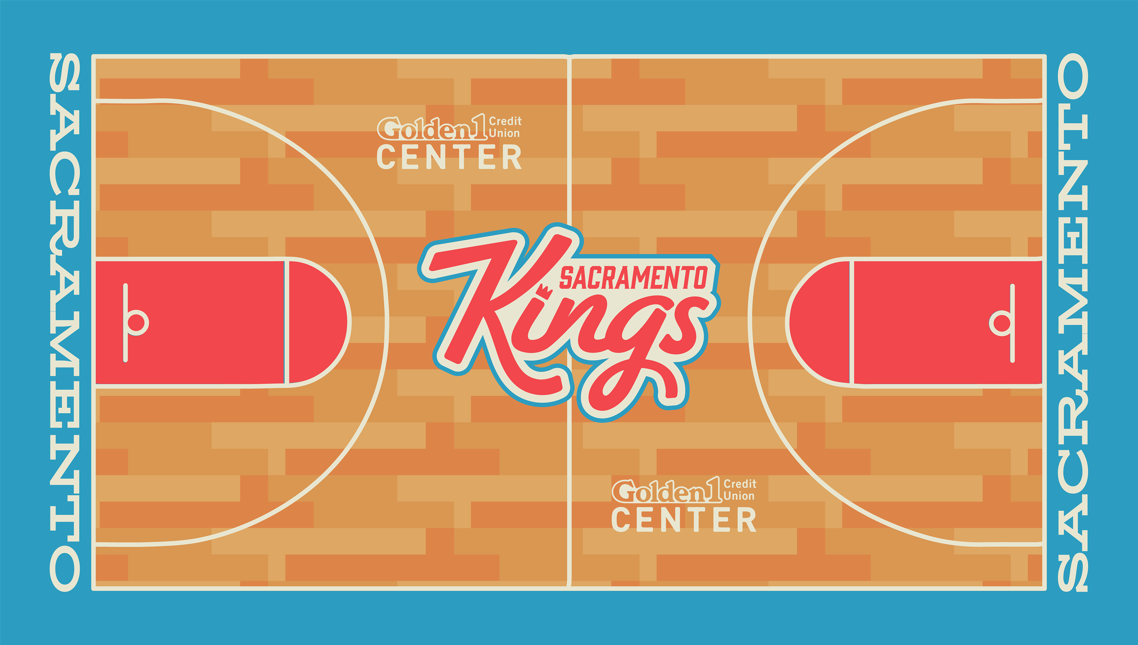
For this self-initiated project, I reimagined the Sacramento Kings' branding by drawing inspiration from their original 1971 color palette of red and blue. My goal was to reintroduce these iconic colors while still honoring the current logo. The redesign emphasizes the crown symbol, representing both royalty and strength, as a centerpiece that bridges the team’s past and present. The updated logo strikes a balance between modern aesthetics and a nod to the franchise’s rich history.
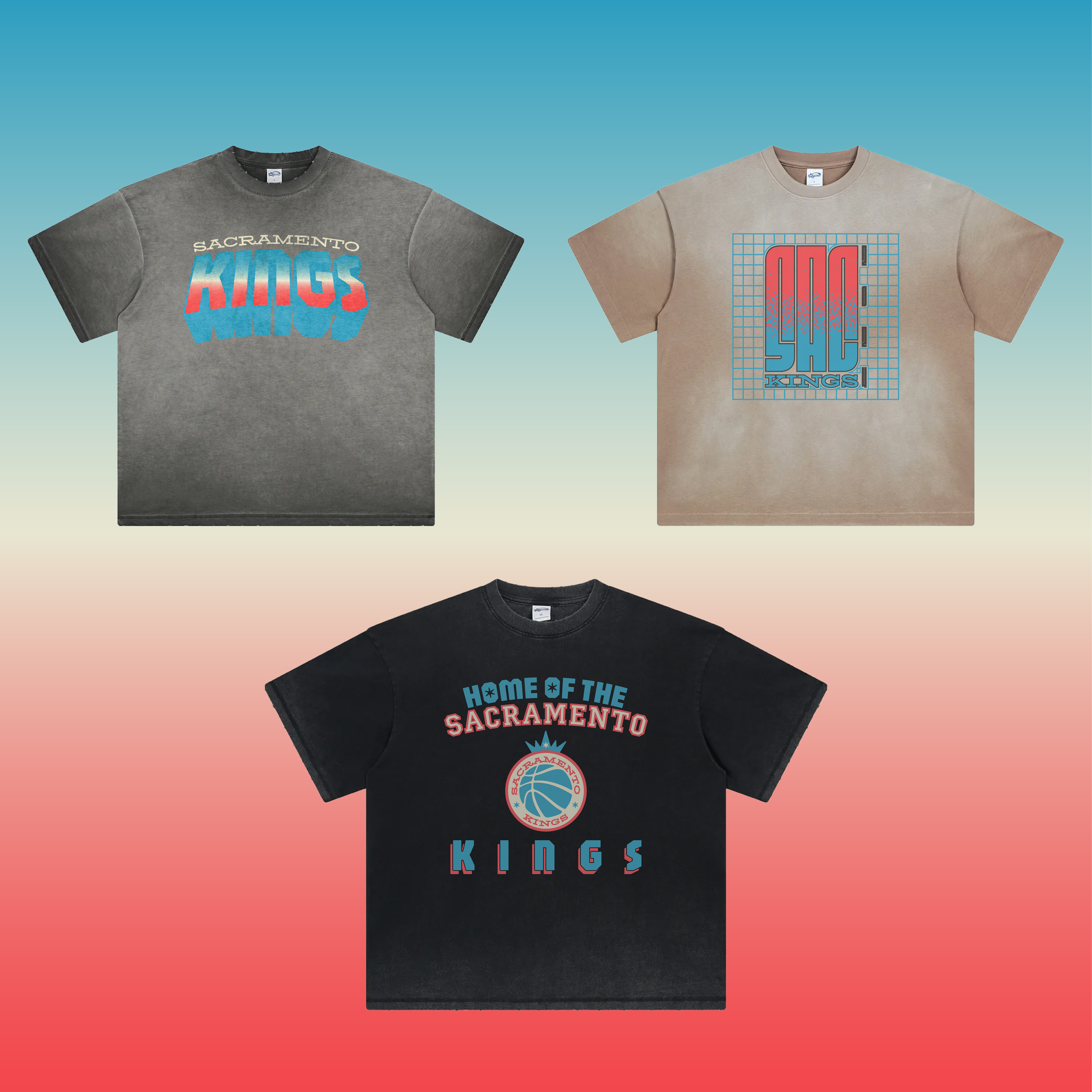
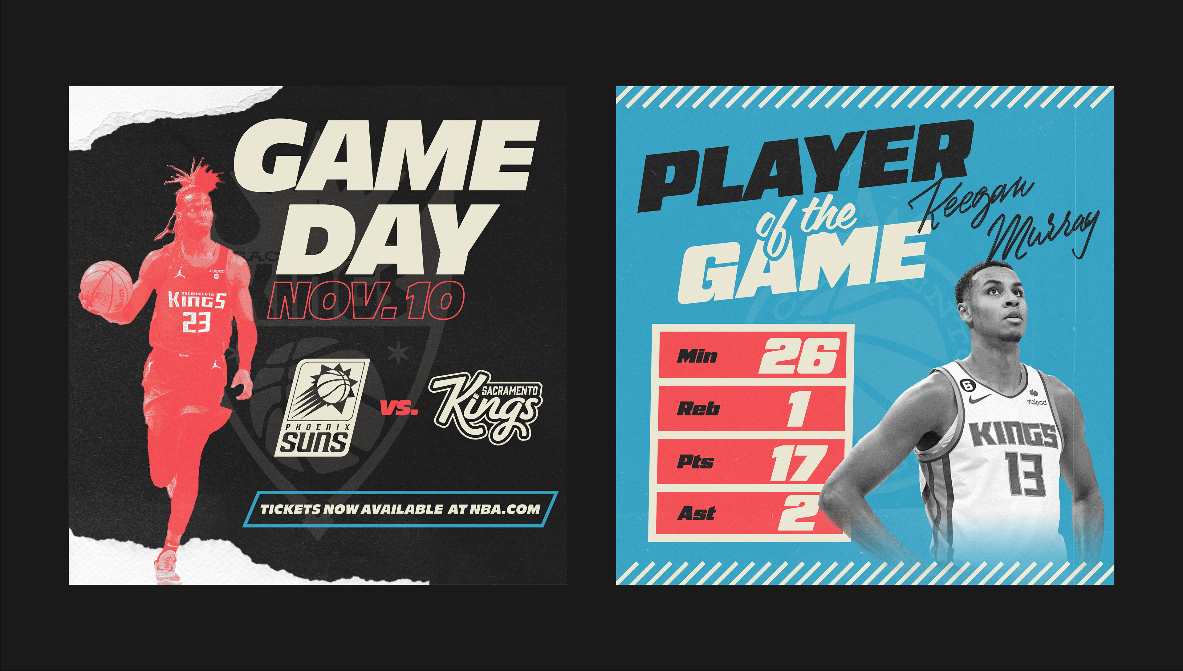
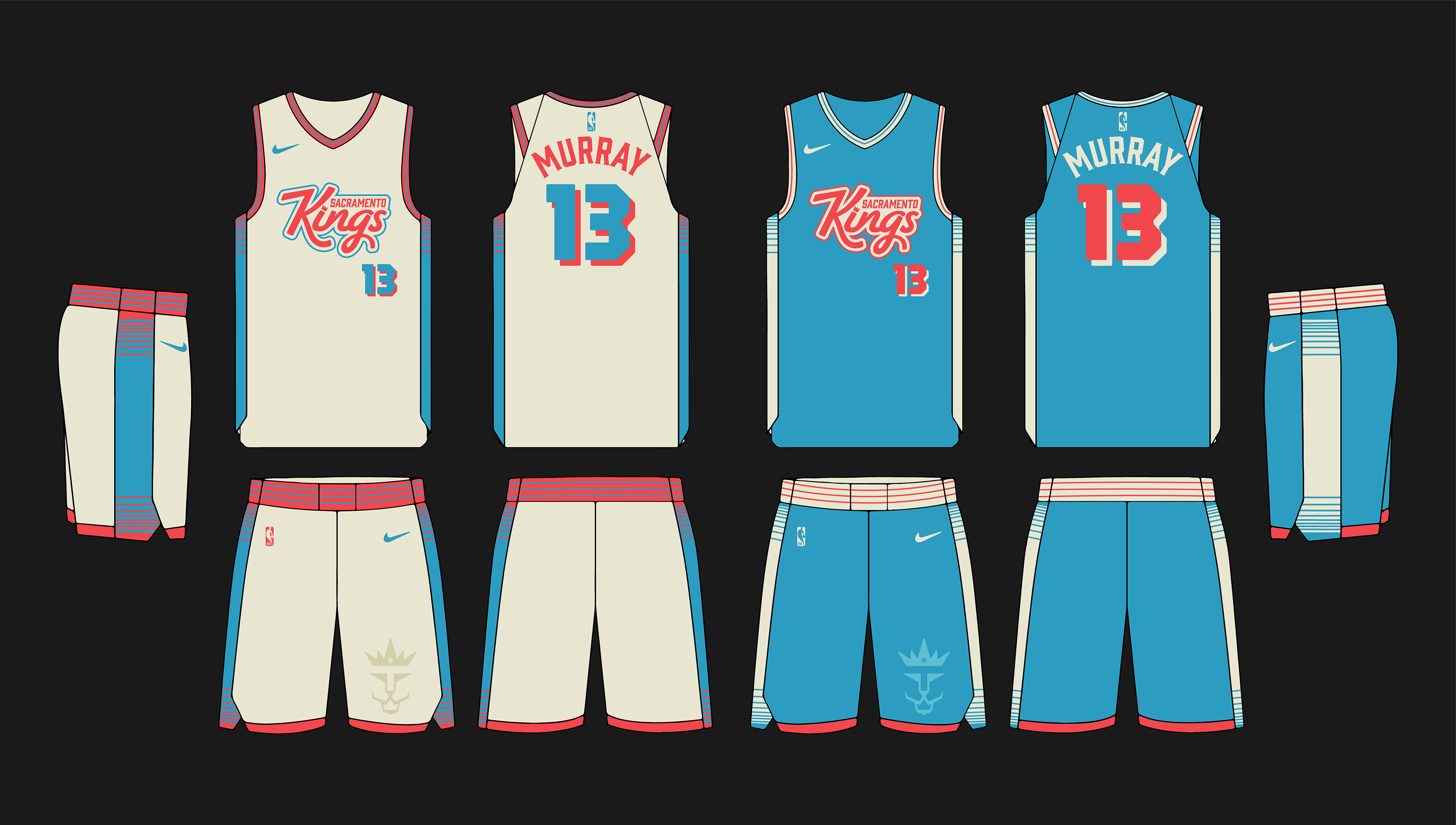
Beyond the logo, I extended the rebranding to multiple touchpoints, including a website homepage and t-shirt designs for merchandise, ensuring consistency across all platforms. I also created social media graphics to establish a cohesive digital presence, along with home and away jerseys that integrate the updated color scheme and logo. Additionally, I designed a new basketball court layout that complements the overall brand identity, reinforcing the team’s energy and spirit. This project allowed me to seamlessly connect sports design, branding, and merchandise, blending tradition with innovation.